UX
When and How I used Lostness metric in UX
Did you know that there is a specific metric that calculates how much users are confused or lost while using the online service (web, app)?
It’s “Lostness Metric.”
Lostness Metric
I first came across this concept while conducting a usability study for Nordstrom’s mobile web navigation. The research goal was to understand how users find products without relying on search bars or filter options. In other words, our team wanted to observe natural browsing behavior — just like how someone would shop by casually walking through a store.
To evaluate the user experience, researchers often gathered the following metrics like:
- Task Success Rate
- Number of Clicks Tapped
- Task Completion Time
However, we quickly realized that Task Completion Time wasn’t telling the full story — especially in the context of an e-commerce platform.
Why Task Completion Time Can Be Misleading in Shopping Platforms
Let’s consider the goals of a shopping platform from both sides:
User Goal : To find desired items easily and efficiently
Platform Goal : To help users find what they need while also encouraging discovery, to increase engagement and also the purchase amount.
If we only optimize for the user goal, fast completion time seems ideal. The quicker the better!
But from a business perspective, a 30-second checkout may actually be less desirable than a 30-minute session that leads to both planned purchases and spontaneous discoveries. That’s where retention, dwell time, and exploratory behavior become valuable.
This is where Task Completion Time falls short. It doesn’t differentiate between ‘intentional exploration’ and ‘unproductive wandering.’ That’s why our team started looking into metrics that could better capture confusion rather than just speed.
What is Lostness Metric?
The Lostness Metric is designed to detect users’ state of confusion when trying to complete a task. On the scale of 1 and 0.4 point being the standard, the higher the number, the more “lost” the user is.
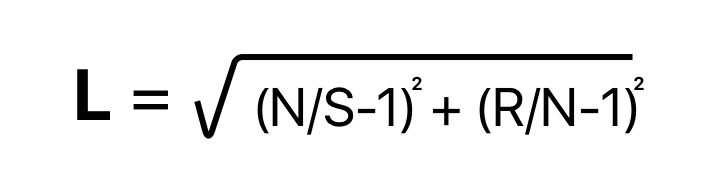
*N = The number of different screens visited during the task.
S = The total number of screens visited during the task.
R = The minimum number of screens that must be visited to complete a task.*
(Source: https://www.shanedoyle.io/post/ux-design-metric-to-measure-lostness)
How I applied Lostness Metric
In our Nordstrom study, we observed that the traditional Lostness formula — designed for linear navigation across pages — didn’t fully apply to modern mobile shopping UIs that are image-heavy and contain multiple tappable links on a single screen.
So we adapted the metric.
Instead of measuring “screens”, we used “touchpoints” within the same interface — treating each tappable element as a navigational decision. This gave us a clearer sense of whether users were confidently exploring, or just tapping around without direction.
By doing this, we could identify screens or flows where users were hesitant, backtracking, or bouncing around, and distinguish them from healthy exploratory behavior.
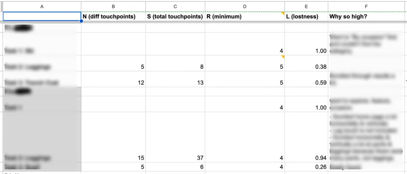
Lostness, a chance to observe Discovery!
In contexts like shopping platforms where discovery is encouraged, metrics that penalize longer session durations can be misleading. By comparing with minimum and the total number of touchpoints, Lostness helped us to observe user’s critical journey and how they were away from the optimal path to find their desired items.
Lostness, not a perfect metric though..
Even though Lostness can measure confusion, it still lacks the context of the user’s intention—‘why’ the user clicked on the link. And that is why consolidating other qualitative and quantitative analysis matters to analyze thoroughly.
Tldr;
😍 Lostness Metric is a powerful alternative when Task Completion Time falls short — especially in discovery-driven platforms where exploration matters just as much as efficiency.
🧐 But since it doesn’t capture why users click or tap different touchpoints, it’s best used in combination with qualitative insights or behavioral analysis to uncover true user intent.
Final Thoughts
This usability project reminded me how important it is to match the right metrics to the right context. In UX research, there’s no one-size-fits-all. The data and metrics we collect should also align with the business goal that we want to solve.
References
- The Complete Guide to Measuring Lostness
- Lostness: A UX metric to measure if your users get lost
- Online user testing and usability platform | UXtweak
Pauline A. Smith; Towards a practical measure of hypertext usability, Interacting with Computers, Volume 8, Issue 4, 1 December 1996, Pages 365–381.
✳ ✳ ✳
When and How I used Lostness metric in UX was originally published in Bootcamp on Medium, where people are continuing the conversation by highlighting and responding to this story.